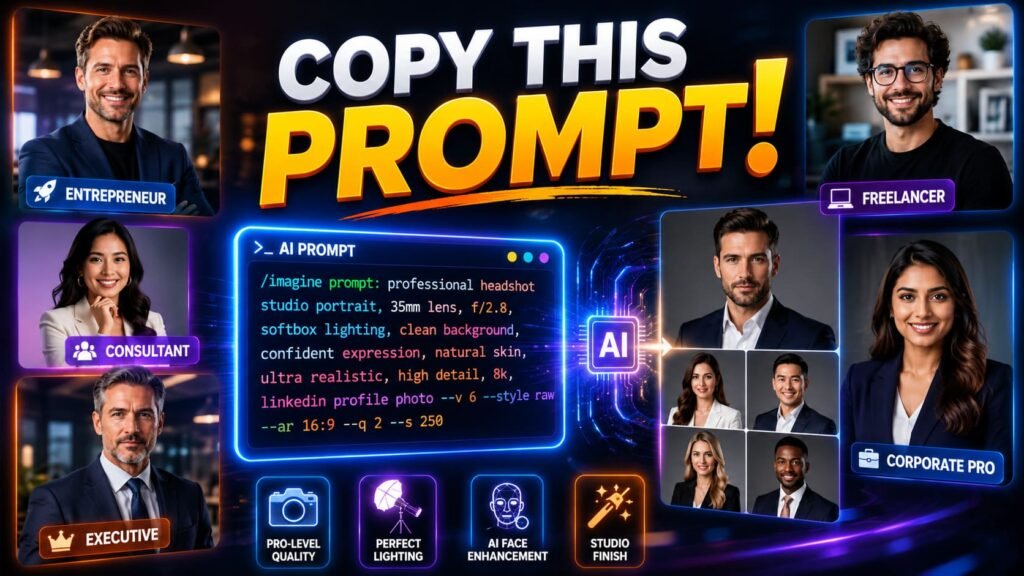
Quick takeaways
|
LinkedIn is a different beast than a general headshot. Your photo gets cropped into a small circle, shrunk down to a thumbnail next to your name in every comment and connection request, and seen by people scrolling fast on their phones. A prompt built for a large printed headshot doesn’t automatically translate to something that holds up at that size.
If you’ve already read our broader guide to AI prompts for professional headshots you can copy and paste, you’ve got the general formula down. This one zooms in on what changes specifically for LinkedIn, the framing, the expression, and the small details that make the difference between a photo that reads as confident and one that reads as obviously generated the moment someone clicks to expand it.
Why linkedin needs a different approach
Three things make LinkedIn photos behave differently than a standard headshot. First, the crop. LinkedIn forces your photo into a circle, which means anything near the edges of the frame gets cut off entirely. Second, the size. Most people will only ever see your photo as a small thumbnail, never the full resolution version. Third, the context. People are scanning a feed or a list of search results, not studying a portrait, so the photo needs to communicate something in under a second.
None of that changes the five part prompt formula from our pillar guide. It changes how you fill in two of those parts specifically: framing and expression.
📚 In plain English LinkedIn crops your photo into a circle and shows it small most of the time. Build your prompt around that constraint instead of treating it like a generic headshot you’ll resize later. |
Framing for the circle crop
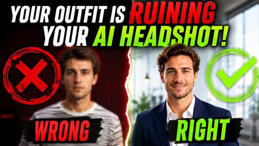
LinkedIn’s circular crop tends to cut closer than people expect. A photo framed loosely from the waist up will lose most of that context once it’s cropped, often leaving an oddly tight shot of just your face and a sliver of shoulder.
Ask for a tighter frame in the prompt itself rather than relying on LinkedIn’s cropping tool to fix it after the fact. “Head and shoulders, centered in frame, generous headroom” gives the model the right composition from the start.
Professional headshot, head and shoulders framing, subject centered with generous headroom, confident warm expression, navy blazer, soft blurred neutral background, shot on an 85mm lens, shallow depth of field, polished not plastic skin.| Standard headshot framing | LinkedIn specific framing |
|---|---|
| Waist up, loose composition | Head and shoulders, tight and centered |
| Off center, rule of thirds | Dead center, since the circle crop is symmetrical |
| Background can extend into the corners | Background detail in the corners gets cut off anyway |
Expression that reads at thumbnail size
A subtle, slight smile photographs beautifully in a large print headshot. Shrink that same photo down to a circle the size of a coin, which is roughly what your LinkedIn photo looks like in a comment thread, and subtlety disappears entirely. What reads as thoughtful at full size can read as flat or even unfriendly at thumbnail size.
For LinkedIn specifically, go a little broader than you would for a corporate print headshot. “Genuine warm smile, visible teeth, bright eye contact” holds up better at small sizes than “subtle confident smile.”
LinkedIn headshot, genuine warm smile with visible teeth, bright direct eye contact, charcoal blazer over a light blue shirt, soft off white background with gentle blur, even bright lighting, shot on an 85mm lens, photorealistic, polished not plastic skin.What changes for linkedin specifically | |||||
|
|
| |||
Background choices that work inside a circle
A rectangular background that looks balanced in a normal photo can end up lopsided once it’s cropped into a circle. Detail sitting in the corners, like a window or a piece of furniture, gets sliced off entirely, sometimes leaving an odd sliver of something half visible at the edge of the crop.
Simple, centered backgrounds avoid this problem completely. A soft gradient or a blurred neutral wall keeps the same even look no matter how tightly LinkedIn crops the final image. Save the more detailed, scene setting backgrounds, like a bookshelf or a city skyline, for headshots that won’t get squeezed into a circle.
LinkedIn headshot, soft gradient gray background fading evenly from edge to edge, no distinct objects or furniture visible, confident warm smile, navy blazer, even bright lighting, head and shoulders framing, shot on an 85mm lens.Background choice versus circle crop result | |
Detailed background Bookshelf, window, or city skyline often gets sliced unevenly by the circular crop, leaving a strange half visible object at one edge | Simple gradient background Stays even and balanced no matter how tightly the photo gets cropped into the circle |
Why some linkedin ai headshots still look fake
A quick look through Reddit threads about AI LinkedIn headshots turns up a pretty consistent pattern. People aren’t generally questioning whether AI headshots work for LinkedIn. They’re pointing out specific tells: skin that’s been smoothed past the point of looking real, backgrounds that are obviously a pasted studio set, faces that are slightly too symmetric to be believable.
Every one of those complaints traces back to a missing piece of the prompt, not a limitation of the tool itself. Skip the texture instruction and skin goes plastic. Skip the depth of field instruction and the background looks flat and fake. The fix isn’t switching tools, it’s going back to the prompt and filling in what got left out.
⚠️ Common mistake Uploading a heavily filtered or already edited reference photo and expecting the AI to produce something natural. The model amplifies whatever’s already off in your reference, so start from an unfiltered photo whenever possible. |
More linkedin specific prompts to try
A few more variations depending on your role and the tone you’re going for.
LinkedIn profile photo, confident approachable smile, modern smart casual outfit, soft neutral gray background with blur, even bright studio lighting, head and shoulders framing centered in the circle crop, sharp focus on the eyes, photorealistic.LinkedIn headshot for a startup founder, relaxed genuine smile, blazer over a plain t-shirt, soft blurred coworking space background, warm natural light, head and shoulders framing, polished not plastic skin.LinkedIn headshot for an executive profile, composed confident expression with a warm undertone, structured blazer, near black studio background, soft directional key light, tight centered framing, photorealistic skin texture.Adjusting for your industry on linkedin
The general LinkedIn formula above works for most profiles, but a few industries benefit from small adjustments. Recruiters scanning hundreds of profiles a day tend to favor photos that signal approachability fast, while industries like finance or law lean slightly more formal even on LinkedIn specifically.
For creative fields, a slightly more relaxed expression and a less corporate wardrobe choice tends to read as more authentic, since an overly formal photo can actually work against you if your profile is otherwise full of creative work samples. For finance, law, and consulting, sticking closer to the structured blazer and composed expression keeps the photo consistent with what connections in those industries expect to see.
LinkedIn headshot for a creative professional, relaxed genuine smile, smart casual outfit with a subtle pop of color, soft blurred studio background, warm natural light, head and shoulders framing, photorealistic.LinkedIn headshot for a finance or consulting profile, composed confident expression, structured navy or charcoal blazer, neutral gray background with soft blur, even bright lighting, tight centered framing, photorealistic skin texture.None of this changes the underlying mechanics. It’s the same framing and lighting principles from earlier in this guide, just leaning the wardrobe and expression choices slightly one way or the other depending on what your specific field actually expects to see.
Common misconceptions about linkedin headshot prompts
Myth: any professional headshot prompt works fine for LinkedIn. The crop and the small display size change what actually reads well. A prompt tuned for a large print headshot can look oddly tight or flat once it’s shrunk into a circle.
Myth: a subtle expression always looks more polished. At full size, sure. At thumbnail size, subtlety reads as flat. LinkedIn rewards a slightly broader, more visible expression than a formal print headshot would.
Myth: AI LinkedIn headshots always look obviously fake. That reputation comes from prompts missing the texture and depth of field instructions, not from any real limitation in current tools. Fill in those gaps and most people won’t look twice.
Myth: you need a completely different prompt formula for LinkedIn. You don’t. The same five part structure from our general headshot guide still applies, you’re just adjusting the framing and expression pieces to match how the photo actually gets displayed.
Putting it together
Start from the general headshot formula, then tighten the framing and brighten the expression for LinkedIn specifically. If a result still looks slightly off once it’s cropped into the circle, check whether the issue is really the prompt or just the source photo you uploaded as a reference. For more on getting the underlying prompt structure right before you ever get to LinkedIn’s particular constraints, the foundational guide on how to write AI image prompts that actually work covers the broader mechanics this article builds on.
LinkedIn’s own guidance on profile photo best practices is worth a quick read too, since it covers the platform’s actual technical requirements around file size and dimensions, details that matter regardless of whether the photo was taken with a camera or generated from a prompt.