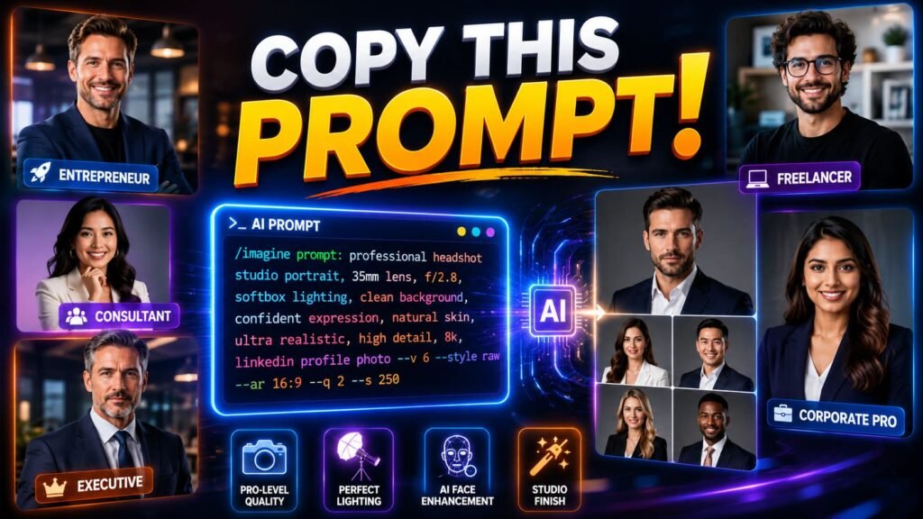
Quick takeaways
|
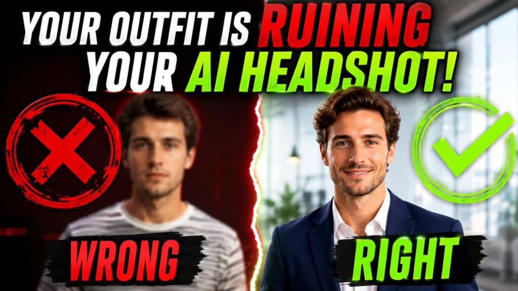
Open any AI headshot prompt list and the wardrobe instruction usually reads the same way: “professional attire” or “business clothing.” It’s the laziest part of most prompts, and it shows. Vague wardrobe language is one of the fastest ways to end up with a photo that looks almost right but slightly off, like the outfit was painted on rather than worn.
Clothing carries more visual information than people expect. Fabric affects how light bounces. Pattern affects how clean the edges render. Fit affects whether the whole photo reads as natural or stiff. None of that gets communicated by the word “professional.”
Why “business attire” isn’t enough
When you tell an AI model “business attire,” it has to guess everything: the color, the fabric, the cut, how it fits the body. It usually lands on something generic, a flat gray blazer that looks more like a costume than clothing someone actually owns.
Compare that to “charcoal blazer over a cream silk blouse.” Now the model knows the exact color palette, and just as important, it knows silk is a material that catches light differently than cotton or wool. That single word, silk, changes how the fabric folds and reflects light in the final image. It’s not decoration. It’s information the model genuinely needs.
📚 In plain English Naming the fabric isn’t about sounding fancy. It’s giving the model physics to follow, since different materials catch and bounce light in genuinely different ways. |
What to wear in your prompt
A few categories of clothing show up consistently in prompts that produce clean, believable results. None of these require an expensive wardrobe, just specific words.
- Structured blazers. “Tailored navy blazer” or “charcoal wool blazer” renders more reliably than loose, flowy jackets because the model has a clearer shape to work with.
- Solid color tops. A cream silk blouse, a light blue dress shirt, a deep emerald sweater. Solid colors give the model fewer surfaces to mess up.
- Simple necklines. Crew necks, collared shirts, and modest v necks all render cleanly. Complicated draping or asymmetric cuts are harder for the model to get right.
- Quarter zips and sweaters for a casual register. If your actual job doesn’t call for a blazer, “navy quarter zip sweater over a collared shirt” reads as professional without looking like a costume.
| Wear this | Skip this |
|---|---|
| Solid colors, blazers, simple necklines | Stripes, plaids, busy florals |
| Minimal jewelry that won’t catch light oddly | Large statement pieces or shiny accessories |
| Clothing that matches your actual job | A suit and tie if you’ve never worn one to work |
What to leave out of the prompt
Patterns are the biggest culprit here. Tight stripes, small checks, and busy florals create a visual effect called moire, a warping or shimmering distortion that happens when fine repeating lines interact badly with how the model generates pixels. It’s the same reason striped shirts sometimes look strange on video calls. AI models hit this problem even harder than cameras do.
Jewelry is the second issue. Reflective metal, faceted gemstones, anything with a shiny surface, these are genuinely difficult for image models to render without artifacts. A simple watch is usually fine. A statement necklace with multiple reflective surfaces often comes out warped or smeared.
Three wardrobe choices that cause problems | |||||
|
|
| |||
Match the outfit to your actual job
This is the part most generic wardrobe advice skips entirely. A graphic designer in a three piece suit doesn’t look polished, it looks like a stranger wearing someone else’s clothes. If your real work wardrobe is smart casual, your headshot should be too, even if “business formal” feels like the safer default.
The goal isn’t to look as formal as possible. It’s to look like a believable, slightly better version of how you actually show up to work. A startup founder in a blazer over a plain t-shirt reads as authentic. The same founder in a full suit and tie reads as a photo that’s trying too hard, and oddly, that mismatch is often what tips a viewer off that something’s not quite right, even if they can’t say exactly why.
⚠️ Common mistake Defaulting to “formal business suit” for every prompt regardless of your actual profession. If you’ve never worn a suit to work in your life, it’ll usually look like a costume in your headshot too. |
Color choices that photograph well
Color does almost as much work as fabric. Jewel tones and deep neutrals tend to render with more depth than pale pastels, which can wash out against light backgrounds and make the whole photo look flat. Navy, charcoal, deep emerald, and burgundy are reliable choices across most prompts.
Skin tone matters here too, though not in the way people often assume. The goal isn’t picking a color that “matches” you. It’s picking a color with enough contrast against your background that the model has a clear edge to render around. A pale cream blouse against a white studio background can blur the outline of your shoulders in a way a deep blue wouldn’t.
Colors that hold up well in prompts | |||
Navy | Charcoal | Emerald | Burgundy |
Wardrobe prompts you can copy
Here are a few starting points organized by register, from formal to casual.
Charcoal pinstripe suit with a white shirt and burgundy tie, structured fit, minimal accessories.Structured black blazer over a cream silk blouse, no jewelry besides simple stud earrings.Navy quarter zip sweater over a collared light blue shirt, sleeves untucked, casual but neat.Smart casual button down shirt in a solid sage green, sleeves rolled to the forearm, no jacket.Drop any of these into the full five part prompt structure covered in our guide to AI prompts for professional headshots you can copy and paste, where wardrobe is just one piece alongside expression, background, and lighting. If you want the deeper mechanics of why specific language outperforms vague language across any AI image prompt, not just headshots, the breakdown in how to write AI image prompts that actually work covers that ground in more detail.
Common misconceptions about headshot wardrobe prompts
Myth: more formal always looks more professional. A suit on someone who’s never worn one looks fake, not impressive. Formality should match your actual role, not some generic idea of business.
Myth: patterns add visual interest the way they would in a real photo. In AI generation, tight patterns are far more likely to glitch than enhance. Solid colors are the safer choice almost every time.
Myth: jewelry makes the photo look more polished. Reflective surfaces are one of the hardest things for these models to render cleanly. A simple watch is fine. A statement necklace usually isn’t worth the risk.
Myth: you need to describe every garment in detail. One well chosen fabric word, silk, wool, cotton, does more than three vague adjectives. Specificity in one place beats vagueness spread across many.
Building your own wardrobe line
Once you’ve picked a register, formal, business casual, or smart casual, the formula stays simple: garment type, color, and one fabric or texture word. “Charcoal blazer,” “silk blouse,” “cotton button down.” That’s usually enough for the model to render something believable, and it’s a lot more reliable than reaching for adjectives like sleek or polished, which don’t describe anything the model can actually act on.
If your first attempt still looks slightly off, check whether the issue is really the wardrobe or something else entirely. The American Society of Media Photographers has a useful overview of professional headshot standards that’s worth a look if you want a sense of what real photographers aim for before you start tweaking your prompt further, since matching that baseline is usually the actual goal either way.